 Courtesy of Galen Harrison
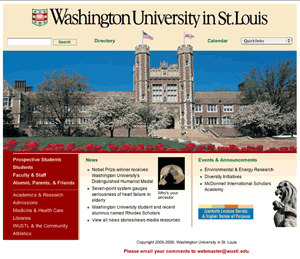
Tulips garnish the preview of the newly released Washington University Web site design on the homepage at www.wustl.edu.
The new Web site will replace the current design, which, according to Mary Ellen Benson, assistant vice chancellor and executive director of publications, is being refreshed after about three years on the Web.
This new look, according to Benson, will feature many improvements over the original, both in terms of organization and aesthetic appeal.
The idea for a new Web site originated in 2005, when a technology group affiliated with Student Union (SU) approached Benson with concerns about the current design. Additionally, many stakeholders in the University’s Web site were unhappy with the current site.
“We decided that we needed a forum for people interested to get together and talk about the page,” said Benson. “The people who represent that area of the University, I thought they needed to hear each other.”
A Web advisory committee, headed by Benson, was made to discuss the future of the outdated design. It included members of the Department of Admissions, two student representatives from SU and stakeholders in the Web site.
“The feedback almost immediately was we needed to redesign the Web site,” said Benson.
Benson said that although the current Web site is strong in many ways, including its content, it has many weaknesses that hinder its effectiveness at providing information to visitors. One such major problem with the site, she said, is its organization and navigation.
“One of the things we discovered was, once you got below the top page, the navigation links were very inconsistent from page to page,” she said.
The poor navigation system ultimately prevents visitors from maneuvering through the site as easily as possible and thus reduces the ease at which information can be found.
One such example on the University’s home page is that, although there are 14 primary links in the main menus leading to other areas of the site, these menus are not always present on the main pages of all of the other areas, preventing easy navigation from area to area. Benson also said that there were too many of these main menu links, and it may have made finding some pieces of information a much more difficult task.
The other problems centered on the aesthetic qualities of the site. Benson said that the Web site was in need of a refresh.
“One of the complaints we heard over and over again is that it didn’t have enough color in it,” said Benson.
The background of the current design is mostly white, with small amounts of color as menu headers and borders. Additionally, she said that that the banner on the current site is not as large as it could be.
As a result of these design flaws in the current Web site, the new design will feature many changes. First, the menus will be organized into one list on the left side of each page. Two columns adjacent to the menu column will have news headlines and upcoming events.
“I think the navigation is a lot smoother,” said Benson. “We now have consistent navigation on the side of the pages.”
The new design will feature a much higher use of colors and a larger University banner to spice up the aesthetic appeal of the Web site. A new search tool and a directory link will be added to the top of the page. Additionally, special menu will be added to include “quick links,” which lead to pages that visitors may load frequently.
The new Web site will not only make viewing the Web site a more pleasant experience, but it may help the school market itself to prospective students. According to Benson, an admissions representative sat on the Web advisory board and provided input on the new site.
“The undergraduate admissions office is very pleased with it,” said Benson.
Admissions officials were unavailable for comment.
 MCT CAMPUS
 Lionel Sobehart